Description:
Create a web page layout using a grid.
Process (Process, tools, skills, FOCUS principles):
- First, I had to choose between two ideas I had regarding the webpage I wanted to create. I decided to choose the same business I used in the Business Identity Project.
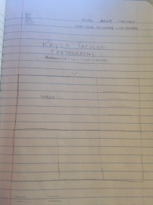
- Then, I started sketching ideas for the website layout.
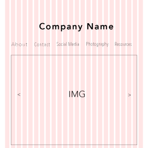
- Next, I went to photoshop to create a shape map of my idea. I felt that my initial idea was too minimalistic to attach to my brand, so I added a more professional look.
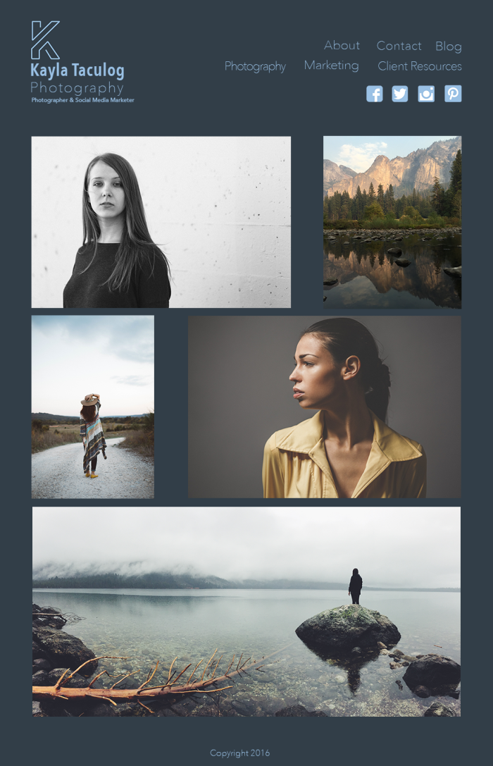
- Then, I started on my actual web page mockup page. I inserted title, logo, menu items, thumbnails of photography, and footer information.
- My final project ended up differently than I had originally intended as I added more images and different alignment of the tab text.
Critique:
I received feedback from Danielle Esplin. She suggested I arrange the featured photos so that the spacing was more uniform. She also suggested that I move the menu text onto two lines rather than three and to also move the social media icons below them.
Facebook Critiques: n/a
One-on-one critique: Danielle Esplin
Instructor Critique: n/a
Message:
To showcase photography and my portfolio to potential and existing clients.
Audience:
People looking for photography and social media marketing services.
Top thing learned:
I learned the importance of alignment, especially with using the guides provided.
Color scheme & color names:
Monochromatic–blue and white.
Title font name & category:
Avenir Next Condensed–Sans serif.
Copy font name & category:
Avenir Next Condensed–Sans serif.
Thumbnails of any original, unedited image(s) used in project:


Source of each image (website name and hyperlink):

I thought you did a great job creating white space through out the web page. Everything looks neatly spaced and that is a uge strength in your web page. One thing I would change is put everything in the top right corner somewhere else, usually it fits best on the bottom of the page but you could do somewhere else and that would work too.
https://http8356.wordpress.com/
https://kaylactaculog.wordpress.com/2016/11/16/web-page-mockup-project/
LikeLike
Kayla, I love what you did for your website. It looks like a real website. It looks very professional. I like the monochromatic color scheme you’ve stuck with. It adds so much consistency amongst your branding and all your projects.
https://jasminrock.wordpress.com/2016/11/17/10a-web-page-mockup/
https://andiwilliamsblog.wordpress.com/2016/11/16/web-page-mockup/
LikeLike
I like your use of squares for shape and design. I think you have a great use of white space. Your design is appealing, especially with the blue monochromatic color scheme. I also like that your social media pins coordinate with your color scheme. Good job!
Check out my blog: https://cynthiacarter.wordpress.com/2016/11/17/235/
Here’s another great one too: https://1libertyanneblog.wordpress.com/category/design/
LikeLike
Kayla this looks so cool and is really clean. It matches your logo really nicely with the simple lines and the straightforwardness of it all. The colors and just all of it in general blends really well together.
https://atmecham.wordpress.com/2016/11/16/web-page-mockup-project/
https://indiacomms.wordpress.com/
LikeLike
You’ve got a striking design there, Kayla. The muted dark colors are easy to read, while at the same time they contrast well with the brighter photographs. It’s a simple design, to be sure, but that’s not a bad thing. Plenty of white space and good font choice make it good enough for anyone.
As per our instructions, here’s my blog:
https://infinitecomm130.wordpress.com/2016/11/17/10a-web-page-mockup/
And here’s Brianna’s blog:
https://briannaharoldsencomm.wordpress.com/2016/11/16/web-page-mockup-project/
LikeLike